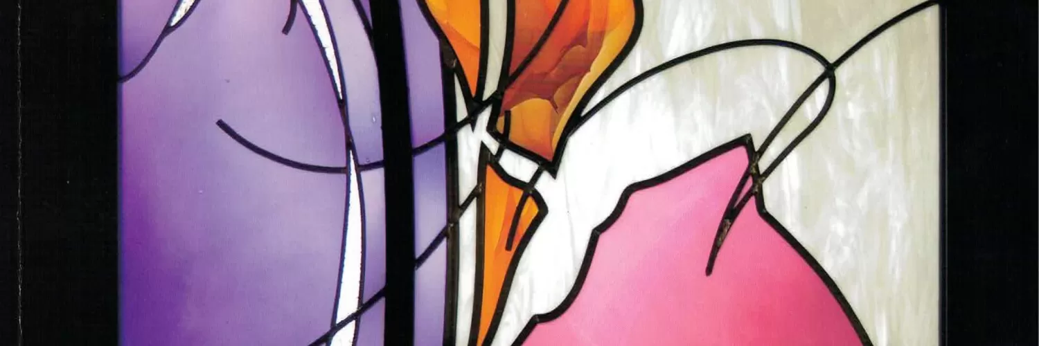
We recently saw a post highlighting the work of Kessler Studios for the Peri State College Library in Peru, Nebraska and the images seemed so familiar... and that's because they were! We featured that commission as the cover art on the Summer 2008 SGQ.
Here follows an excerpt from the article and a few images from the article. For more SGQ stories and back issues, check out our store here (opens new window).
Peru State College Commission
by Cindy & Bob Kessler
Kessler Studios recently completed two projects for the Peru State College Main Library in Peru, Nebraska. The first phase was a Percent for Art commission, and the second was requested after completion of the first.
Percent for Art programs promote the use of artwork in certain public buildings, requiring that approximately one percent of the construction budget be used for architecturally integrated artwork. In the case of Peru College, the renovation of a beautiful, historically significant building into a new, high-tech campus library triggered a Percent for An "Call to Artists."
From a shortlist of four artists, Cindy and Bob Kessler of Kessler Studios were awarded the commission for their two-part proposal. A series of five stained glass panels would depict me historical uses of the building, each titled according to the story within: "The Chapel," "The Gymnasium," "The Science Building," "The Art Department," and "The Roller Rink." A stained glass triptych would speak of the college experience as an academic and personal journey, titled "The Journey." Both proposals were presented to the committee using highly realistic maquettes, with the art glass designs being reproduced on translucent acetate.
The old building afforded the main library an open, expansive floor plan, with a high vaulted ceiling more than two stories overhead. The new, ultramodern interior details contrasted tastefully with the classic architectural elements of the historic building. Large windows with original true-divided-lites, graced three of the room's four walls.
Although the exterior glazing provided a wonderful abundance of light, the mullions created a distracting backdrop for stained glass. The solution was two-part. First, the art glass panels were suspended out from the existing windows, providing a separation between the two. Second, the glasses in the artwork would have to be either opaque or obscuring of the visual distraction beyond.
A large percentage of German-made Lamberts glass was used, especially the opals and opaks, which add a thin layer of white on the back, rendering it opaque. Being mouth-blown – as it has been for centuries – every sheet of glass has a gentle shading variation that adds subtle interest. The smooth richness of Lambcl1'S colored glass was paired with a slightly streaky white, made domestically by the Spectrum Company. For the triptych, a grid of glue-chip bevels was added to the palette of glasses.
... continued in The Stained Glass Quarterly Summer 2008: Volume 103, Number 2

